Steven Pemberton, CWI, Amsterdam, the Netherlands.
Alain Couthures, AgenceXML, France.
Keywords: XML, XForms, presentation, CSS, styling, skinning
XForms [xf1, xf2] is an XML-based declarative programming language. XForms programs have two parts: the form or model, contains descriptions of the data used, and constraints and relationships between the values that are automatically checked and kept up to date by the system; and the content, which displays data to the user, and allows interaction with values.
Content is presented to the user with abstract controls, which bind to values in the model, reflecting properties of the values, and in general allowing interaction with the values in various ways. Controls are unusual in being declarative, describing what they do, but not how they should be represented, nor precisely how they should achieve what is required of them. The abstract controls are concretised by the implementation when the XForm application is presented to the user, taking into account modality, features of the client device, and instructions from style sheets.
This has a number of advantages: flexibility, since the same control can have different representations depending on need and modality, device independence, and accessibility.
This paper discusses how XForms content presentation works, and the requirements for controls, discusses how one implementation, XSLTForms, implements content presentation, and the use of CSS styling to meet the requirements of controls, and future improvements in both.
Cite as: Steven Pemberton, Alaian Couthures, "(Re)presentation in XForms", Proc XML Prague 2020, pp 139-149, ISBN 978-80-906259-8-3, https://archive.xmlprague.cz/2020/files/xmlprague-2020-proceedings.pdf#page=151
XForms is a declarative markup for defining applications. It is a W3C standard, and in worldwide use, for instance by the Dutch Weather Service, KNMI, many Dutch and UK government websites, the BBC, the US Department of Motor Vehicles, the British National Health Service, and many others. Largely thanks to its declarative nature, experience has shown that you can produce applications in much less time than with traditional procedural methods, typically a tenth of the time [xf].
XForms programs are divided into two parts: the form or model, which contains the data, and describes the properties of the data, the types, constraints, and relationships with other values, and the content, which displays values from the model, and allows interaction with those values. This can be compared with how HTML separates styling from content, or indeed how a recipe first lists its ingredients, before telling you what to do with them.
The model consists of any number of instances, collections of data that can either be loaded from external data:
<instance src="data.xml"/>
or can contain inline data:
<instance>
   <payment xmlns="">
      <amount/>
      <paymenttype/>
      <creditcard/>
      <address>
         <name/>
         <street1/>
         <street2/>
         <city/>
         <state/>
         <postcode/>
         <country/>
      </address>
   </payment>
</instance>
Properties can then be assigned to data values using bind elements. Properties can be:
types (which can also be assigned with schemas):
<bind ref="amount" type="decimal"/>
relevance conditions:
<bind ref="creditcard" relevant="../paymenttype = 'cc'"/>
required/optional conditions:
<bind ref="postcode" required="true()"/>
<bind ref="state" required="../country = 'USA'/>
read-only conditions:
<bind ref="ordernumber" readonly="true()"/>
constraints on a value:
<bind ref="age" constraint=". > 17 and . < 65"/> <bind ref=creditcard" constraint="is-card-number(.)"/>
or calculations:
<bind ref="total" calculate="sum(instance('order')/item/price)"/>
XForms controls are used in the content to display and allow interaction with values, such as output:
<output ref="amount" label="Amount to pay"/>
input:
<input ref="creditcard" label="Credit card number"/>
or selecting a value:
<select1 ref="paymenttype" label="How will you pay?">
   <item label="Cash on delivery">cod</item>
   <item label="Credit card">cc</item>
   <item label="By bank">bank</item>
</select1>
XForms controls bind to values in instances, and are unusual in that in contrast with comparable systems, they are not visually oriented, but specify their intent: what they do and not how. Visual requirements are left to styling.
This has an important effect: the controls are as a result device- and modality-independent, and accessible, since an implementation has a lot of freedom in how they can be represented. The controls are an abstract representation of what they have to achieve, so that the same control can have different representations according to need.
Since implementations have a degree of freedom in how they represent controls, they can take the properties of the values into account in deciding how to do it.
The major effect is based on relevance, and demanded by the language: if a value is not relevant, then the control it is bound to is not displayed. So for instance, if the buyer is not paying by credit card, then the control for input of the credit-card number
<input ref="creditcard" label="Credit card number"/>
will not be displayed. Note that most XForms data properties depend on a boolean expression, and so the property can change accordingly at run time.
The display of values that are not even present in the data, which can be seen as a sort of super-nonrelevance, is similar: controls that are bound to values that are not present are also not displayed. This is in particular useful for data coming from external sources, where certain fields may be optional in the schema. Note that a value may later become available, for instance as a result of insertions, so that the control has nevertheless to be ready to accept a value.
Another property of importance is type, where the implementation may adapt the input control to the type of data that it represents. The classic example of this is a control bound to a value of type date, which allows the implementation to pop up a date picker rather than requiring the user to type in a complete date. Another classic example is a control bound to a value of type boolean, allowing the control to be represented as a check box.
The remaining properties, while not affecting the form of the control, affect other styling aspects.
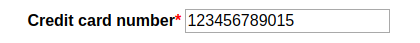
If a control is bound to a value that is required, then it gives the implementation the opportunity to indicate that fact to the user is a consistent manner, for instance by putting a small red asterisk next to the label, or colouring the background red, or both.
If a control is bound to a value that is readonly, then the control will look similar, but should be represented in a way that makes it clear to the user that the value is not changeable.
The final property of interest here is general validity, both type validity as well as adherence to a constraint property. If the value is non-valid, the implementation can display the control in such a way as to make that clear. Additionally, all controls can have an alert message associated with them, that the implementation displays when the value is invalid:
<input ref="creditcard" label="Credit card number"
       alert="Not a valid credit card number"/>
XForms was deliberately designed to allow different implementation strategies. For instance:
As an example, one widely used implementation, XSLTForms [xsltf], works by using an XSLT stylesheet [xslt] to transform the XForm in the browser, client-side, into a combination of HTML and Javascript, so that all processing takes place on the client. This has an additional advantage, over a pure server-side implementation, that 'Show Source' shows the XForms source, and not the transformation.
Such an approach requires the design of equivalent constructs in HTML+Javascript to implement the XForm constructs. Since XForms controls contain a lot of implicit functionality, even apparently simple cases can require quite complex transformations.
As an example, the transformation of
<input ref="creditcard" label="Credit card number"
       alert="Not a valid credit card number"/>
gives the following HTML:
<span class="xforms-control xforms-input xforms-appearance xforms-optional
             xforms-enabled xforms-readwrite xforms-valid"
      id="xsltforms-mainform-input-2_10_2_4_3_">
   <span class="focus"> </span>
   <label class="xforms-label" id="xsltforms-mainform-label-2_2_10_2_4_3_"
          for="xsltforms-mainform-input-input-2_10_2_4_3_"
         >Credit card number</label>
   <span class="value">
      <input class="xforms-value"
             id="xsltforms-mainform-input-input-2_10_2_4_3_" type="text"
             style="text-align: left;"/>
   </span>
   <span class="xforms-required-icon">*</span>
   <span class="xforms-alert">
      <span class="xforms-alert-icon"> </span>
      <span id="xsltforms-mainform-alert-4_2_10_2_4_3_"
            class="xforms-alert-value"
           >Not a valid credit card number</span>
   </span>
</span>
plus a number of event listeners to implement the semantics.
This exposes two essential aspects of the transformation: enclosing
<span> elements for the control as a whole, and each of its
subparts – label, input field, support for the required property and alert
value; and the use of class values to record properties of the
control and its bound value. In this case you can see that it is recorded as
being a control, in particular an input control, that the
value is optional not required, the control is
enabled, the value is readwrite, and (currently)
valid. Since these last four values are dynamic, depending on a
boolean expression and the type, they can change during run-time, for instance
xforms-valid can become xforms-invalid.
Here is another example for a similar control, but bound to a value of type boolean:
<input ref="truth" label="boolean"/>
which gives:
<span class="xforms-control xforms-input xforms-appearance
             xforms-optional xforms-enabled xforms-readwrite
             xforms-valid" id="xsltforms-mainform-input-2_6_2_4_3_">
   <span class="focus"> </span>
   <label class="xforms-label"
          id="xsltforms-mainform-label-1_2_6_2_4_3_"
          for="xsltforms-mainform-input-input-2_6_2_4_3_">boolean</label>
   <span class="value">
      <input type="checkbox"
             id="xsltforms-mainform-input-input-2_6_2_4_3_"/>
   </span>
   <span class="xforms-required-icon">*</span>
   <span class="xforms-alert">
      <span class="xforms-alert-icon"> </span>
   </span>
</span>
Note that since type is not a dynamic property, the system does not have to be prepared for types changing.
One advantage of using HTML as target code is that you have the power of
Cascading Style Sheets (CSS) [css] at your disposal to support presentation. In
particular the CSS can use the class values as shown in the
examples above to affect the presentation.
The most obvious case is for when a value becomes non-relevant, and therefore the control becomes disabled. CSS can be used to remove the control from the presentation:
.xforms-disabled {display: none}
In fact, because of CSS cascading rules, it is essential in this case to override the cascade:
.xforms-disabled {display: none !important}
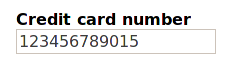
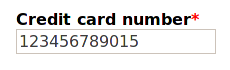
Another case is dealing with whether the value is required or not. There is an element in the markup that holds an icon to be displayed if the value is required:
<span class="xforms-required-icon">*</span>
The default is not to display it:
.xforms-required-icon {
    display: none;
}
unless the value is required:
.xforms-required .xforms-required-icon {
    display: inline;
    margin-left: 3px;
    color: red;
}
giving
A further case is if a value is invalid. All information about
presentation for invalidity is contained in the span element of
class xforms-alert:
<span class="xforms-alert">
      <span class="xforms-alert-icon"> </span>
      <span id="xsltforms-mainform-alert-4_2_10_2_4_3_"
            class="xforms-alert-value"
           >Not a valid credit card number</span>
   </span>
</span>
Similarly to required, the default is not to display it:
.xforms-alert {
    display: none;
}
and then if the value becomes invalid, to display it
.xforms-invalid .xforms-alert {
    display: inline;
}
along with the alert icon:
.xforms-alert-icon {
   background-image: url(../img/icon_error.gif);
   background-repeat : no-repeat;
}
giving:
Using CSS properties, hovering over the alert icon pops up the alert text:
For a planned new version of XSLTForms, we are working on a number of improvements in the visual approach, as well as in the use of the CSS, and the format of the transformed HTML, the aim being to make the default styling more attractive, and more flexible. (What is presented here is work in progress.)
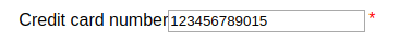
For a start, labels will be styled bold, and by default above the control:
This helps in lining up controls vertically and generally makes the style more restful to the eye.
This is simply done by making the label element a block, with bold font:
.xforms-label {font-weight: bold; display: block}
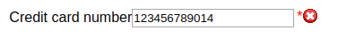
In the case of a value being required, although the transformed
HTML contains a representation of the asterisk to be included, in the element
with class xforms-required-icon, since CSS offers the ability to
insert text, it gives more flexibility to ignore the required icon, and instead
insert it from the CSS:
.xforms-required-icon {display: none}
 .xforms-required .xforms-label:after {content: '*'; color: red}
giving:
This also means that in the future transformed HTML, the span
element with class of required-icon no longer needs to be
included.
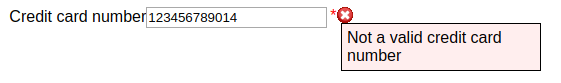
If a value is invalid, either due to its type or a constraint, using the same technique a large red X can be displayed after the label:
.xforms-invalid .xforms-label:after
    {content: ' ✖'; color: red}
However, because of CSS cascading rules, only one of these rules can match at any one time, so that if a value is both required and invalid a rule has to be added to match that case as well:
.xforms-required.xforms-invalid .xforms-label:after
    {content: '*✖'; color: red}
For invalid input values, the background of the input field will additionally be coloured a light red:
.xforms-invalid .value input
    {background-color: #fcc; border-style: solid; border-width: thin}
Finally for invalid values the alert text has to be displayed. Normally alerts will not be displayed:
.xforms-alert-icon {display: none}
 .xforms-alert {display: none; position: relative;}
(Again the alert-icon element is no longer needed in the
transformed HTML.)
On becoming invalid, the alert text can be popped up:
.xforms-invalid .xforms-alert {display: inline}
 .xforms-alert-value {
    color: white;
    background-color: red;
    margin-left: 0.5ex;
    border: thin solid black;
    padding: 0.2ex
}
the end result being:
Unfortunately, CSS in general doesn't allow the reordering of content, but nevertheless there is some freedom to how labels of controls can be positioned. Since the label element is textually before the input field in the transformed HTML, it is easy to position the label above or to the left of the control. For instance, instead of above the control as in the last example, to the left:
.xforms-label
   {display: inline-block; width: 12ex; text-align: right}
giving
With care, labels can be positioned to the right of the control, by floating the label element, or with even more care, below, using relative positioning.
To give the user some freedom in how XForms are displayed, but without
having to know details of CSS, a skinning technique will be used [bootstrap,
bulma]. This is where a top-level element is given classes that indicate
presentation requirements of the enclosed content. For instance, the enclosing
body element can indicate the positioning required for labels:
<body class="xforms-labels-left">
CSS rules then key off this value to provide different presentations for different cases:
.xforms-label {font-weight: bold}

 .xforms-labels-top .xforms-label
    {display: block; margin: 0}

 .xforms-labels-left .xforms-label
    {display: inline-block; width: 20ex; text-align: right}
Thanks to containment hierarchy, this offers quite a lot of flexibility, since even in one XForm different sets of controls can be formatted differently:
<group class="xforms-labels-left">
   ...
</group>
<group class="xforms-labels-top">
   ...
</group>
HTML5 [html5] allows you to define custom elements for a document.
Although these wouldn't offer any additional functionality, transforming to an HTML using themwould mean that the transformed HTML can be kept far closer to the original XForm. As an example, a control such as
<input ref="creditcard" label="Credit card number"
       alert="Not a valid credit card number"/>
could be transformed to
<xforms-input xf-ref="@creditcard">
    <xforms-label>Credit card number</xforms-label>
    <xforms-alert>Not a valid credit card number</xforms-alert>
</xforms-input>
XForms offers a lot of flexibility in how it can be implemented. One of the advantages of implementing it by transforming to HTML means that the power of CSS is available for presentation ends. However, to avoid requiring the XForms programmer to necessarily know CSS, skinning techniques can be used to offer flexibility to the presentations available. A new XForms implementation is in preparation that will use those techniques.
[bootstrap] Bootstrap https://getbootstrap.com/css/
[bulma] Bulma http://bulma.io/documentation/overview/classes/
[css] W3C, CSS, 2020, https://www.w3.org/Style/CSS/
[html5] W3C, HTML5, http://www.w3.org/TR/html5/.
[xf] Steven Pemberton, An Introduction to XForms, XML.com, 2018. https://www.xml.com/articles/2018/11/27/introduction-xforms/
[xf1] John Boyer (ed.), XForms 1.1, 2009, W3C, https://www.w3.org/TR/xforms11
[xf2] Erik Bruchez, et al., XForms 2.0, W3C, 2020, https://www.w3.org/community/xformsusers/wiki/XForms_2.0
[xslt] W3C, XSLT, https://www.w3.org/TR/xslt/all/
[xsltf] Alain Couthures, XSLTForms, AgenceXML, 2014, http://www.agencexml.com/xsltforms