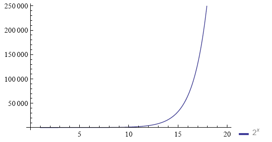
A graph of the data
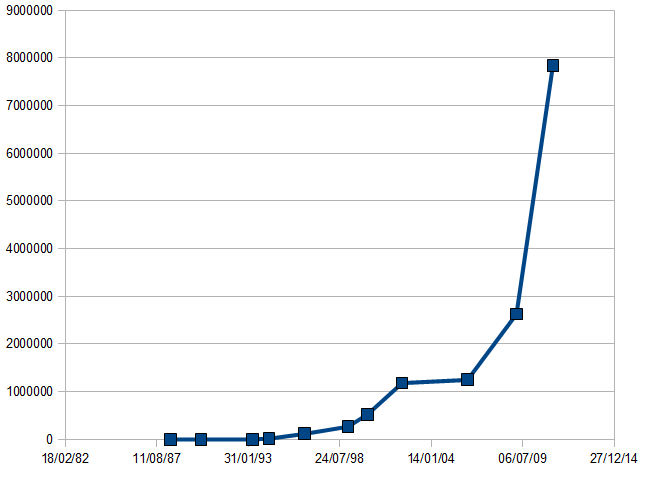 This
graph suggests that the 2006 computer is underpowered, but the problem is
computer power over time is an exponential function, so to see the detail at
the lower end, we need to use a logarithmic scale.
This
graph suggests that the 2006 computer is underpowered, but the problem is
computer power over time is an exponential function, so to see the detail at
the lower end, we need to use a logarithmic scale.
Take a look at the following data, measuring the speed of my laptops over a period:
Date |
Speed |
10/06/88 |
800 |
02/04/90 |
1600 |
06/05/93 |
2083 |
05/05/94 |
16666 |
19/06/96 |
118175 |
22/01/99 |
268212 |
24/03/00 |
527093 |
16/04/02 |
1183152 |
17/03/06 |
1250000 |
19/02/09 |
2630000 |
24/04/11 |
7837000 |
If I told you one of those computers was seriously underpowered for its time, would you be able to tell which one?
This
graph suggests that the 2006 computer is underpowered, but the problem is
computer power over time is an exponential function, so to see the detail at
the lower end, we need to use a logarithmic scale.
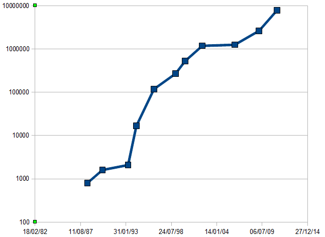 Now we can see that the 1993 laptop is under-powered, but something looks
wrong with the last three as well. In fact, this graph revealed the problem:
the speed measured was the speed of one core. All machines except the last
three were single-core machines. The figures for the last three should be
multiplied by the number of cores.
Now we can see that the 1993 laptop is under-powered, but something looks
wrong with the last three as well. In fact, this graph revealed the problem:
the speed measured was the speed of one core. All machines except the last
three were single-core machines. The figures for the last three should be
multiplied by the number of cores.
But not from the data?
Because we are putting another independent processor to work.
Time yourself on the following three examples.
| 37 | 17 | 85 | 67 | 61 | 80 | 74 |
| 24 | 96 | 27 | 21 | 54 | 68 | 87 |
| 49 | 69 | 28 | 11 | 78 | 51 | 79 |
| 81 | 43 | 68 | 46 | 16 | 83 | 23 |
(The audience took 18, 8 and 2 seconds for these tasks, and by the way got progressively better results, with no errors on the last example)
Note that usability is about making tasks faster, error-free and more enjoyable. By visualising data, you make the data more usable.
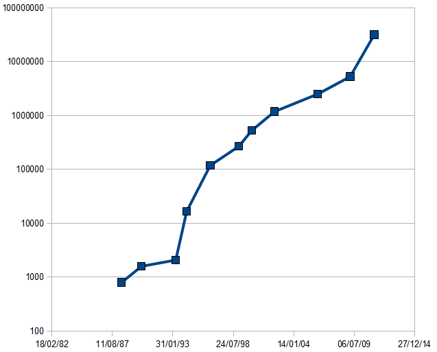
 You may have heard
references to "passing the knee in the exponential curve" or similar. In the
above graph the knee appears at about the 15th doubling.
You may have heard
references to "passing the knee in the exponential curve" or similar. In the
above graph the knee appears at about the 15th doubling.
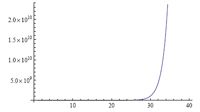 However, if we take a
larger range, the knee appears around the 30th doubling. The knee is an optical
illusion caused by using the wrong sort of graph. Exponential functions should
use a logarithmic scale.
However, if we take a
larger range, the knee appears around the 30th doubling. The knee is an optical
illusion caused by using the wrong sort of graph. Exponential functions should
use a logarithmic scale.
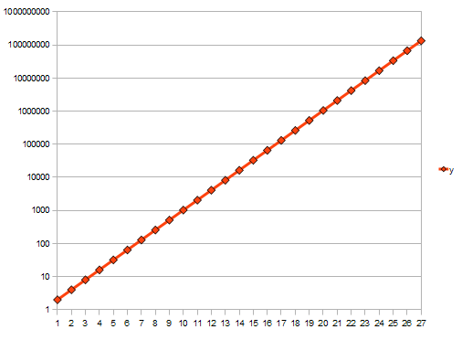 Using a logarithmic scale you see a straight line; there is no knee.
Often people don't understand the true effects of exponential growth.
A BBC reporter recently: "Your current PC is more powerful than the computer they had on board the first flight to the moon". Right, but oh so wrong (Closer to the truth: your current computer is several times more powerful than all the computers they used to land a man on the moon put together.)
To demonstrate this, take a piece of paper, divide it in two, and write this year's date in one half:
Now divide the other half in two vertically, and write the date 18 months ago in one half:
Now divide the remaining space in half, and write the date 18 months earlier (or in other words 3 years ago) in one half:
Repeat until your pen is thicker than the space you have to divide in two:
This demonstrates that your current computer is more powerful than all other computers you have had put together (and way more powerful than the computer they had on board the first moonshot).
This is just another visualisation of an exponential, but with more relevance to the point being demonstrated.
Anyone who wants to do anything with data visualisation should make sure they have read Edward Tufte's books, such as Envisioning Information.

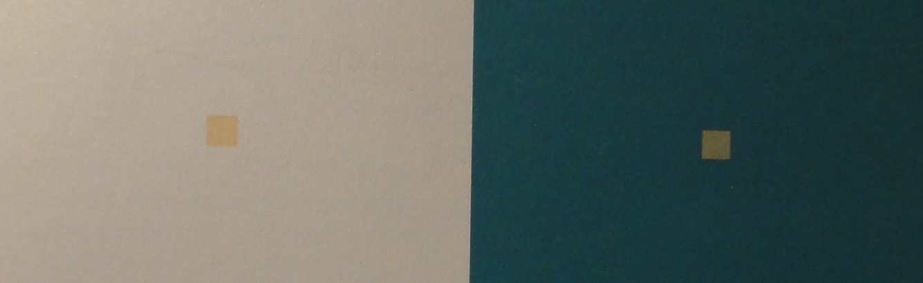

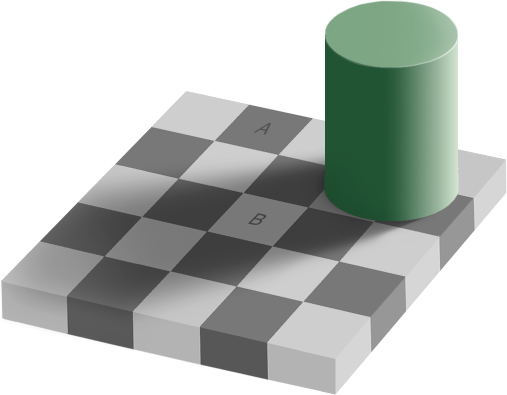 A and B are physically the same colour (they really
are), but our visual systems interpret them differently
A and B are physically the same colour (they really
are), but our visual systems interpret them differently
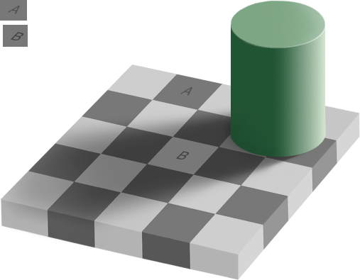
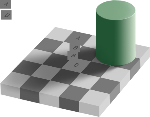

Contrast helps our visual system see detail
This short introduction was intended to sensitise you to the whys and some of the pitfalls of visualising data.